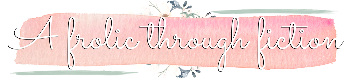
The title says it all!
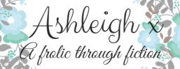
A frolic through fiction has had a slight revamp 😀
I wasn’t actually going to write a post about it, but I figured it’d be a bit odd for me not to acknowledge the differences.

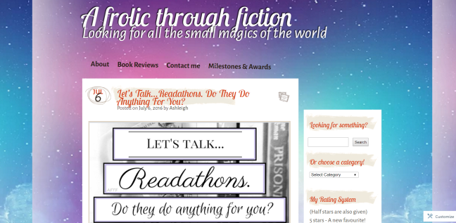

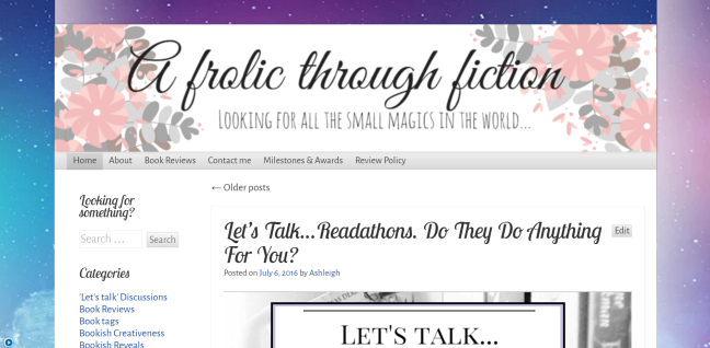
If you follow me on Twitter, you might have already seen this already, but I thought I’d show how it looks on laptops.
Basically, I had some issues with the old theme I used. It was great, but all the photos had a border around them that I couldn’t get rid of, and I really didn’t want them there.
I’ve learnt how to make better graphics too, and really wanted a graphic for my blog title. On the old theme, trying to add the graphic I made just looked stupid against the space background (which, as you can see, is very much still a part of A frolic through fiction), so I’ve changed the theme entirely. Which is why the sidebar is on the opposite side.
All the graphics will be changing on my posts, but other than that…that’s all that’s changed!
Hope you guys like it! There was a really good response on twitter, so that’s encouraging 🙂
Let me know what you think!
Until next time…
Come and visit me!


I think the new blog design looks really nice.
LikeLiked by 1 person
Thank you!
LikeLiked by 1 person
I love it 🙂
Nicely done!
LikeLiked by 1 person
Thank you! 😀
LikeLike
Love it Ashleigh!
LikeLiked by 1 person
Thank you so much! ❤
LikeLiked by 1 person
Love the new look! It looks great!!
LikeLiked by 1 person
Thank youuu!! 😀
LikeLiked by 1 person
Love the new design! It looks great!!
LikeLiked by 1 person
Thank you!! 😀 ❤
LikeLike
It looks very pretty. 🙂 Isn’t making your own graphics for the site fun?!
LikeLiked by 1 person
Thanks! And it is! Though sometimes stressful when I can’t get one right, I’ve discovered haha!
(Sorry this took so long for a reply! It went into the spam box for some strange reason)
LikeLiked by 1 person
It’s gorgeous!! 😍
LikeLiked by 1 person
Thank you Olivia! ❤
LikeLiked by 1 person
I love the new look! It looks really nice 🙂
Just an FYI though, the space background doesn’t show up anymore for me. Thought I’d give you a heads up. 🙂
LikeLiked by 1 person
Thank you!
I saw earlier that on my phone, the background doesn’t show. I’ve got no idea how to fix it though? Might have to do some Googling and see what comes up!
LikeLiked by 1 person
Very nice! I feel like it’s much smoother and better fitting 🙂 I have a couple issues with my theme, too, but I can’t find a good alternative to fit my sites personality… And I also don’t know how to make my own blog graphics/banners (>_<)
But this looks lovely! *thumbs up*
LikeLiked by 1 person
Thanks!
It took me so so long to find a theme that fit. I almost felt like I was being too picky, because I’d preview them all and be like “No it has border around the photos. No, I need a sidebar. No the header doesn’t look right with the background.” and it just went on and on. Found one eventually though!
LikeLiked by 1 person
I know what you mean! I feel picky, too! I do know I want a sidebar. And when I preview themes, sometimes it seems like everything is just so BIG. But if you change the font size, it’s DRASTICALLY different. I’m still working on it (=_=)
LikeLiked by 1 person
I’m still having troubles with mine now, because you can’t see the background on mobile devices…urgghhhh! It can be so frustrating
LikeLiked by 1 person
Well, good luck to both of us!
LikeLiked by 1 person
It looks great! (the background shows up white for me, btw!)
LikeLiked by 1 person
Thanks!
It’s a problem with viewing it in mobile version I think, I need to find a way to fix it! Thank you!
LikeLiked by 1 person
i love your new design, 😉 good job
LikeLiked by 1 person
Thank you!! 😀
LikeLiked by 1 person
It’s looking sweeeeeet! 🙂 x
LikeLiked by 1 person
Thank youuuuu! 😀
LikeLiked by 1 person
😀
LikeLike
Did you change it again? Because now it’s pink on my laptop. The pink and the galaxy with the new headers are really pretty anyway!
LikeLiked by 1 person
On mobile devices the space/galaxy background doesn’t show for some reason, and I can’t fix it so I set the underlying colour as pink, to show up on phones 🙂 It just depends what you view it on!
LikeLiked by 1 person
Oooh okay! The peachy pink colour looks nice anyway;D
LikeLiked by 1 person
Glad to hear! I was getting so frustrated that the background won’t show on mobile, so it’ll have to do!
LikeLike
I love the new theme, it`s soooo pretty!!!! ❤
LikeLiked by 1 person
Thank you so much!!! ❤
LikeLiked by 1 person