After that little break from the blogging tips last Sunday, here we are back again!
We’ve had personal tips. We’ve had writing tips. Well this time, I’m here to bring you a few design tips
Again, the disclaimer of all disclaimers – I am in NO way saying this is the right way to do blogging. I’m not saying I’m particularly great at blogging. I’m just sharing tips that have been helpful to me over my year of blogging so far.
So let’s get on with the design tips!
Now I do have to admit, design isn’t my strong suit. It took me months to get my blog the way it is, purely because I’m so incapable of understanding technology. But I figured I might as well share what I’ve discovered through my hours of Googling and experimenting. So here we go.
Sidenote: All of these tips are entirely optional, of course.
I feel like this is more of a reminder than a tip, really.
But think about it. You use your blog so often, you need to like it. No matter how frustrating it is to design a blog, or how much you can’t seem to get it just right – keep at it until it works for you. It took me 5 months before I was happy with it. And even then, I kept changing my graphics until I was 100% satisfied. To this day, I still try to make better title images because I’m not yet happy with them all. But it’s your blog, and if you don’t like how it looks, it can be so uninspiring to write for it.
You might not want a theme, this is entirely optional. But if you don’t really know what to do with your blog design, try to think of a theme to follow. You might want specific colours. You might want it to look professional. Minimalistic. Girly. Floral. Bohemian. You might have a specific background you want to match it to.
For mine, I based my theme off the word “frolic” in my blog title. I wanted something that looked somewhat whimsical, hence where the colourful space background came from. And from that background came the colour theme for the rest of my blog – pink, purple and blue. Having a theme can just make certain decisions (colours, fonts, style) that little bit easier.
If someone clicks on your blog and there’s just wayyyyyy too much to look at, it can be off-putting.
Easiest way to avoid this is to just be careful of how you layout your sidebar. Spread your text and photos out evenly so it’s not just a bombardment of either one. Especially since the sidebar runs alongside all of your posts, you don’t really want even more text crammed in to distract readers.
This is definitely an optional one. But I loved finding this little trick so I wanted to include it for those who don’t know about it already.
On your homepage, you have the option for little excerpts of each post to be shown rather than the entire post. This can make it so much easier for readers to have a quick scroll through, seeing what sort of things you post about and catching up on anything they might have missed.
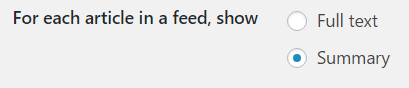
So when writing your posts, there’s this magical button across the top toolbar saying “insert read more tag” – simply add that in near the start of your post and tadaa! Instant excerpt. Also, you can go to your admin page, then click “settings” –> “reading” –> and change this little option down here ↓↓↓ to “summary” …
…meaning people will have to visit your full blog to read your posts rather than just see the text on their WordPress feed.
Title images are the bane of every blog post I write. I still struggle with them, but it’s gotten a bit easier with this tip.
Try to make a vague template for them. If you go through my posts, you’ll notice my review images have the same template to them, along with my discussions having their own theme. Much like having a theme for your entire blog, it just makes things easier when you come to designing your blog posts.
If you’re anything like me, you might be thinking “what the hell is a dimension!?” because TECHNICAL WORD. But don’t worry, it’s actually not something complicated.
Basically, you don’t want your header image to be blurry. Mine used to be, and it annoyed me to hell and back. SO pay attention to the dimensions (I learned this the hard way). When you go to customize and find the apart where you add your header image, there should be a little section above it like this ↓
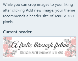
It tells you what your recommended size is – make a header that size and it should fit perfectly! No need to crop or stretch it.
Again, if you’re like me, that = scary technical word.
But no. All this means is make sure your design works on both computer/laptop screens AND mobile phones. Again, I’ve learnt this the hard way. I changed my background size a while ago, only to have people tell me they couldn’t see it on mobile phones. And admittedly, I don’t always check my blog posts design on both laptop and mobile…
BUT it IS easy. On the preview option, all you have to do is click these three buttons ↓

…and it will change the page size, showing you how your blog/posts will look on the different size screens. ALTHOUGH if you change your actual blog design, I’d advise checking on an actual phone rather than the preview too, because I just used the preview and the background thing happened. Just a word of warning.
NOT TO COPY. DON’T DO THAT.
But, if you’re finding it hard to come up with a design for your blog, or graphics, or photo layouts, have a look around bogs you really like, and think about WHY you like them. What is it about the design you like? Is it the colours? Patterns? Is there something you could take inspiration from? Leave them a comment asking what they use to make their graphics or edit their photos, and see if you can play around with the same thing to make your own.
We are each other’s inspiration, so just having another browse through and focusing on the graphics/images/design instead of the writing this time might actually spark your own ideas.
This is my actual lifesaver.
Though I’m pretty sure I’ve said that at least once on each of these tip posts…
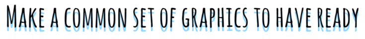
Think about the graphics you want to commonly use. Graphics you need in every post, or even on a weekly basis. Then MAKE THEM.
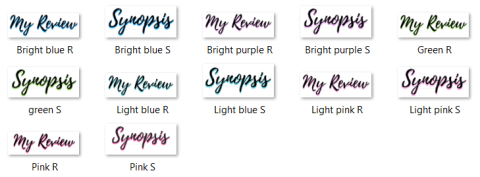
I feel like I’m bad at explaining what I mean, but basically I have a folder full of graphics I use all the time. The graphics for my social media links at the end of each post (scroll down to the bottom, you’ll see what I mean). The graphics for my reviews that say “synopsis” and “my review” – and even the star ratings. And even though the headings “synopsis” and “my review” change slightly with every review (the colour behind them changes to match the title image), I have a folder just full of them, ready to use in advance.
Having all the common graphics made in advance just makes it so much quicker to write blog posts. Trust me on this.


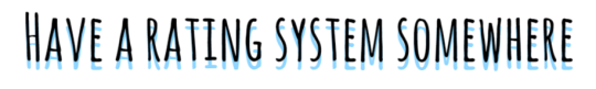
This is more of a personal preference than a tip, but it really does help.
Think about it. If I rate a book 3 stars, to me it’s an alright book. I enjoyed it, but also had a few problems with it. It’s more than half so it must be good to some extent. And yet when I rate books 3 stars, I get people saying it’s a shame I didn’t enjoy it, even though I did. Why? Because everyone uses the star rating differently. While a 3 star is OK to me, it’s a bad rating to someone else.
So why not add your rating system somewhere on your blog? All you have to do is make a small graphic, or even just write it in normal text, and people will understand your ratings that little bit more. It could be on your sidebar, or on your list of reviews, or your review policy. Anywhere will do really 🙂
So there we have it!
Those were my 10 tips on how to make designing a blog just that little bit easier. I really hope you guys enjoyed this post and that it helped even in the slightest way.
The next blogger tips post will just be miscellaneous tips – any other tips that haven’t yet been mentioned or don’t have a particular category. So if you have any other tips you want to hear from me, leave them down below in the comments and I’ll see what I can do!
How did you like this tip post? Did you enjoy it? Was it helpful?
Do you follow any of these tips yourself?
Is there anything else you’d like to know about how I designed my blog/posts?
Are there any tips you’d like to know when it comes to blogging?
Let me know in the comments!
Until next time…
Come and visit me!
Bookish Snapchat: “frolic_fiction”

Love this post! It’s so helpful. Designing can definitely be tricky sometimes!
LikeLiked by 1 person
Glad it helped! And it definitely is – designing can both be fun, but such a stress at the same time!
LikeLike
Great post! I’ll definitely be using some of these 😄
LikeLiked by 1 person
Thank you!
LikeLiked by 1 person
Designing is so stressful. I’m glad that you shared these tips with us!
LikeLiked by 1 person
It really is! Hope they helped 🙂
LikeLike
Wonderful tips! I wish I would have had this to read when i was fighting over my design and template before going public. great post!
LikeLiked by 1 person
Thank you! I wish I knew all this stuff myself when I was doing the same ahaa! But alas, google was my saviour 😆
LikeLiked by 1 person
Great post, Ashleigh! I recently changed my design quite a bit, and going from full-length posts to excerpts on my home page was a huge change for the better on my blog! I also completely agree about having images prepped. Images for my posts certainly take the longest. And I’m no great at it… 😦 I’ll get better.
One tip I’d add is to make certain that your design incorporates an easy way for people to follow your blog! If you use WordPress.com, a follow button appears automatically to otherWordPress.com users. But what if you aren’t? Anything to help build that network of blogger friends will help out. 🙂
LikeLiked by 1 person
I love having excerpts rather than entire posts on my home page, it’s so much easier for people to have a quick browse through if they want 🙂 I’m glad you see it as a benefit too!
And I LOVE that tip! It’s something I did sort of subconsciously – I’m pretty sure my sidebar has about three different ways people can follow my blog 😆 But it’s great for you to mention that, it’s definitely something wordpress users might not think about, especially since the follow button is always there for us!
LikeLiked by 1 person
Absolutely love this post! I never even considered the importance of having a rating system, but now I’m convinced I need to make one. Thank you so much!
LikeLiked by 1 person
Yay! I’m glad to have helped 🙂 I love seeing the difference between other people’s rating systems.
LikeLike
love this 🙂
LikeLiked by 1 person
Thank you!
LikeLiked by 1 person
Yes, thank you! I need to get on the computer and see how my blog looks there: I use the app to figure out most of my stuff, but I never consider how it looks to computer users. And I have to admit, I’m a little intimidated when it comes to making graphics. But I just downloaded Shutterstock to help in the beginning. And I will try to make more time for the design aspect. I’ve been in a default for a long time. Lol. Do you think it matters having a paid account vs a free one?
LikeLiked by 1 person
I personally don’t think it matters. Mine’s a free account, and I’ve had no issue with it being that way.
LikeLike
I really hate it when I come across blogs that display their full blog post on their home page! It takes me so long to scroll through their posts to see what other posts I want to read and comment on. I usually prefer only seeing the posts feature image and title because then I can easily scroll through their posts, but excerpts are a lot better than the full post!
I also think it’s incredibly important to have your social media buttons at the top of your blogs sidebar and all in one place. And for book blogs having a bloglovin’ button is super important because that seems to be the most popular way of following a book blog. I definitely recommend incorporating your social media buttons on the top of your sidebar! It took me a while to locate your follow buttons! If they’re at the top then it’s so much easier and faster.
I definitely agree that a blogs layout needs to be responsive, definitely in this day and age of technology. Websites are getting smarter and people like to read blogs on their phones. It’s nicer to read a blog on your phone when it’s adapted to the screen size 😀
Jordon @ Simply Adrift
LikeLiked by 1 person
Ooh thanks for the tip! I’ll have to have a play around with my sidebar and see if I can put my social media buttons in & still look decent 🙂
LikeLike
Just wanted to say that this post inspired me to re-design my blog and I am just IN LOVE with the look of it now SO THANK YOU!! ❤
LikeLiked by 1 person
OHHH THAT’S SO LOVELY TO HEAR!! ❤ Glad I could help in any way!
LikeLike